Just few days back I exchanged some notes with Founder & CEO of a Ecommerce company on why I never shop online with them. This venture is among the best known Ecommerce brands in India, but its product experience never gave enough confidence to transact with them.This post is result of that interaction. All screenshots included in this post are not meant to single out any particular ecommerce website and this is meant to be a general post on best practices.
This post is also an extension to my previous post on the topic – Product Management and Ecommerce that was written about two years back. While that post was about general product management principles for Ecommerce, this one is a series of posts that are specific towards reducing cart abandonment and improving conversion rates in transaction businesses. Limiting the scope of this post only to Product Page -> Checkout, this post is first in this series and talks about building the right Product Page and best practices to be observed.
Getting the Right Product Page for Ecommerce – Best Practices
When users land up on product pages through some effort (search, discovery, social, email, adwords, etc), the intent of a users here is positively inclined towards ‘knowing more about the product’ or ‘making a transaction’ and not towards abandoning the page.
The positive reinforcements on a product page are –
- Product (the product itself), Photos, Price
- Shipping Information (and Payment Details)
- Additional Information – If the product, photos & price do not help make a purchase decision, then the additional information that can assist in decision making process.
- Alternatives & Suggestions
Building Product Pages is a science & art put together with lots of common sense. They should be built / designed as decision enablers and not with the focus that allows users to look at other options in an event the user is not interested in these products.
a. Focus on One Action – ‘Add to Cart’
Yes this is the obvious point. Why is it here, everyone knows this right?
It is here because everyone knows this and because they also know everything else other than this. Simply look at the product pages of the Ecommerce websites, the number of colors on the design elements of page, multiple call to actions – take away the focus from ‘Add to Cart’ button.
As a standard practice, don’t let more than 3-4 colors creep-in on to the product page. Having a color palette helps here and intelligent use of shades of gray to highlight important information if required. Also most critical aspect is knowing that all information cannot be considered as important.
Showcased below are screenshots from top ecommerce websites in India. Notice the excessive focus on highlighting every piece on information, use of ‘design’ and colors in every product element. Have specifically chosen products that have variables like Size, Color – since those are the most complex ones to get right.
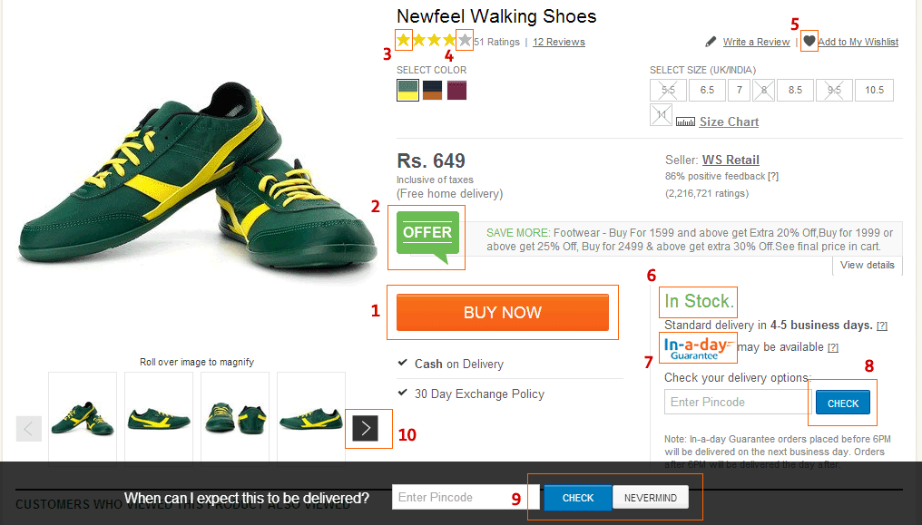
Multiple Components asking for Attention, One of top Ecommerce Sites in India
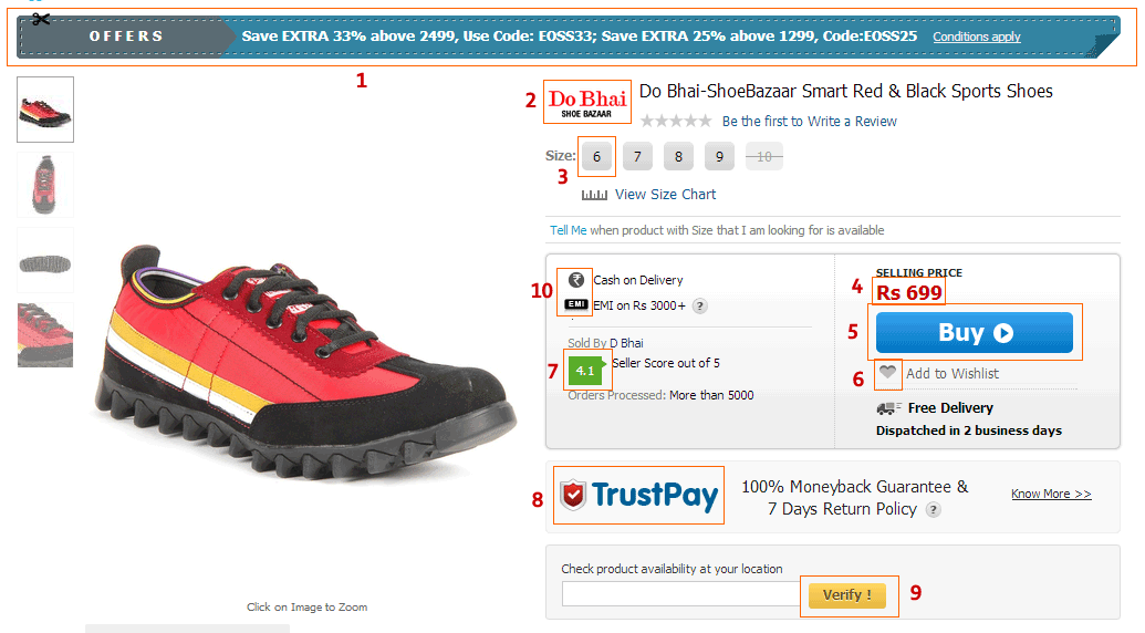
Multiple Components asking for Attention, One of top Ecommerce Sites in India
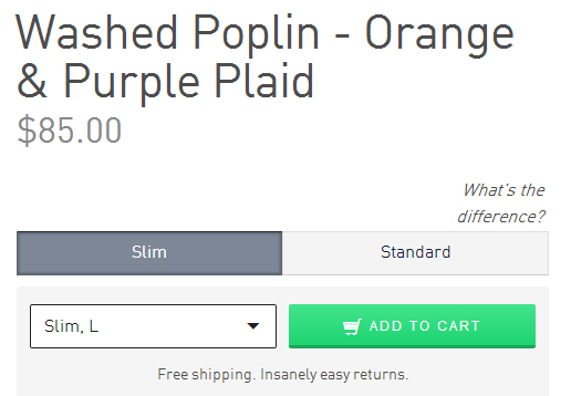
Know how to make ‘Add to Cart’ stand out – look at a product page from NastyGal.com
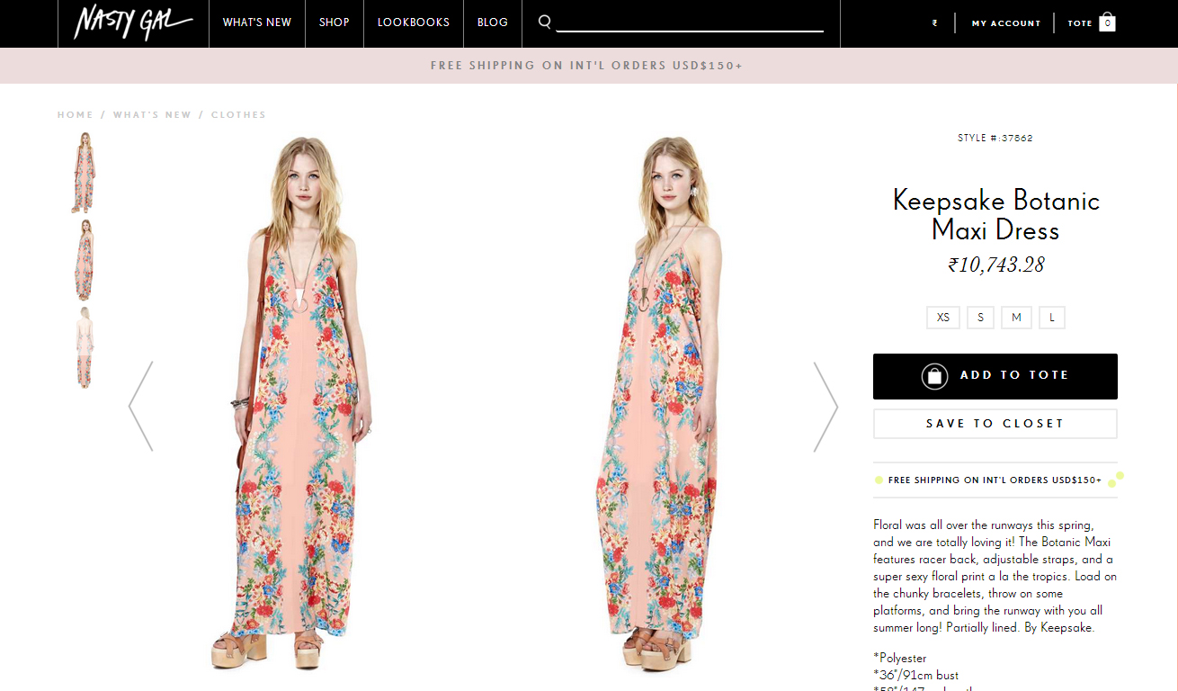
NastyGal Product Page – Notice the focus on ‘Add to Cart’
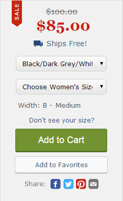
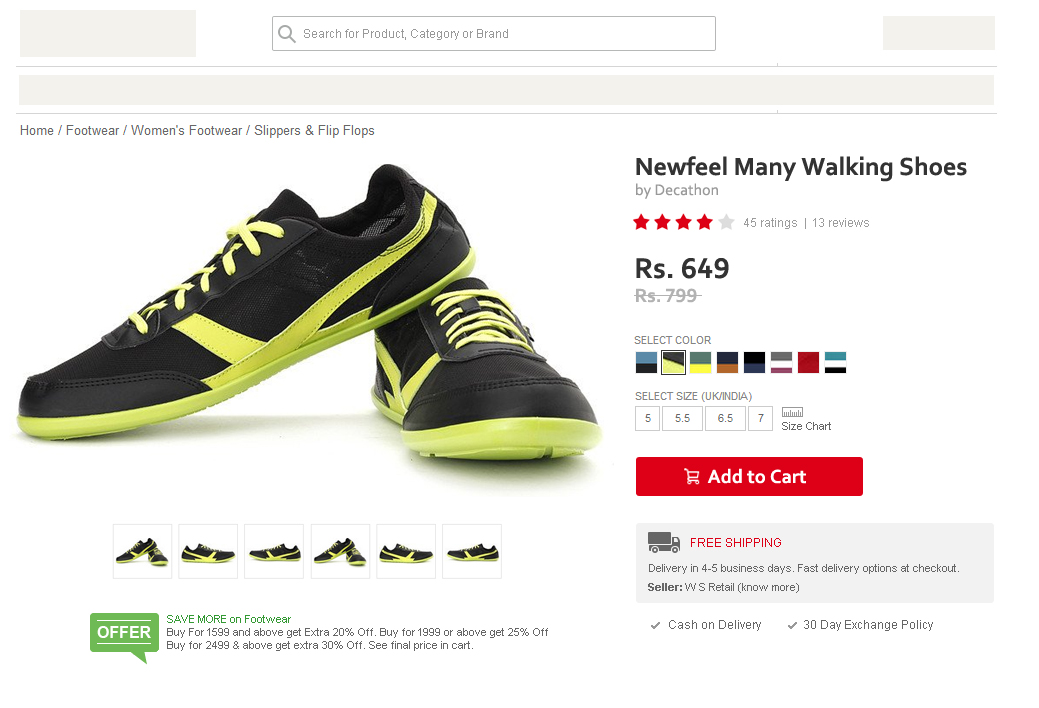
b. Getting all Decision Enablers next to ‘Add to Cart’ Button
The most important decision enablers (either features or information) should be as closed to the ‘Add to Cart’ button as possible, not miles away. The information should be presented in a top-down readable format – specially for categories and verticals like Clothes, Shoes and others where to process the order you need Size, Style, Color and other such information.
Factors making up the Purchase Decision
It is first essential to figure out what are the most crucial 2-3 factors / information that a user needs to know and also accepting that not all information is must.
Add to Cart on Bonobos
Add to Cart on Zappos
c. Use Standardized Communication & Symbols
One of the key things to focus on your product page (or anywhere on the product) is user communication. From simple things like should it be ‘Add to Cart’ or ‘Buy Now’ or ‘Add to Bag’ to another simpler things – its a tough job.
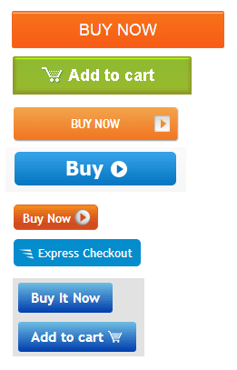
Standardization? Its a mess out there.
Choose widely used terms for communication. I would always suggest using ‘Add to Cart’ because 90% of other websites use it. Remember user is moving on multiple websites, and he has got familiarized with the term. Do not re-invent things for the user. Even for symbols, Shopping Cart has a universal symbol across millions of website.
Same for terms like Cash on Delivery. Free Shipping.
Another issue with Ecommerce websites is the excessive focus on branding everything. It starts from ABC TrustPay, XYZ Assurance, LMN 100% Purchase Protection or PQRS Guarantee, etc to putting up details for Sellers (Marketplaces) – ratings, stars, % feedback, etc. While all that is great, why does a customer need to know this? If its for assurance – there is no need to copy paste such fancy terms across the website.
Thinking from a consumer point of view, if there is any goof-up on any transaction – user will hold the website liable for its service, whether or not it is a marketplace or a store. A simple message like one from ASOS – “Free Returns. Not quite right? Send it back for Free” or from Jabong – “30 Days Free Return / Exchange” does the trick.
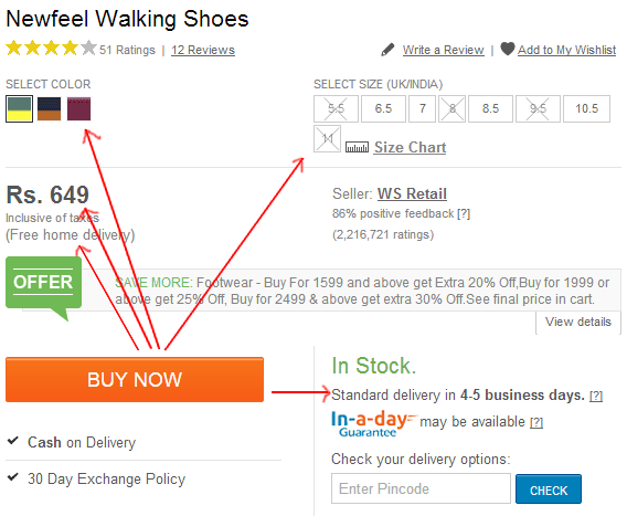
One of the leading ecommerce venture says uses the term ‘Free Home Delivery’ which I relate more with restaurant food deliveries and less with ecommerce.
PS: For some reasons, Indian Ecommerce websites love coming up with their own Glossary of Terms!
d. Handling Exceptions on Product Pages
Some of the best user experience practices are seen on products that handle exceptions really well. Only following a simple principle – “Do not show user information that is not applicable’ goes a long way in removing information overload and simplifying user’s buyer experience.
Here are the few common ones that should be displayed only when applicable –
- EMI on Rs. 3000 – shown for all the products even those priced below that limit.
- Showing Cash on Delivery for products on which it is not applicable
- ‘Free Shipping’ when not applicable or Showing ‘Free Shipping on products above Rs. 500’ when the product is already above that amount.
- Ships from Chennai – Shown to user who is from Delhi. (Unnecessary second thoughts for the user – what matters is that product is shipped in time, not from where it is)
- In Stock. Of-course, why else would you display ‘Add to Cart’ button.
- Offers. Most offers kill Ecommerce profits (and the service too) – but since it is a trend now to show them, display only offers applicable to the product. Avoid blanket offers for a category.
- Twin Carts
- Asking ‘Are these reviews helpful?’ when there are no reviews.
- Private Listing of products shown to all.
- Free Returns or Exchange displayed on products that are not applicable like Lingerie, Cosmetics, etc
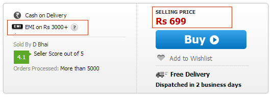
Showing EMI when not applicable
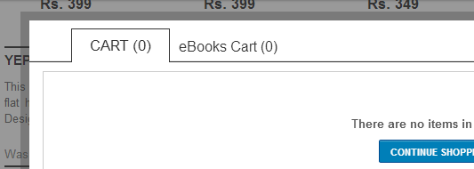
Dual Carts – Not applicable to > 95% users
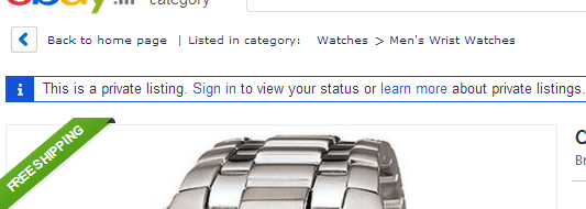
Private Listing? Why show it to users then.
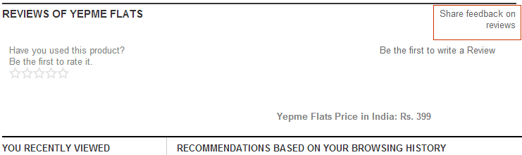
Feedback on Reviews not written yet.
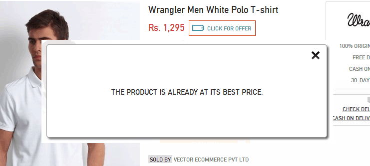
Showing Offers when none available
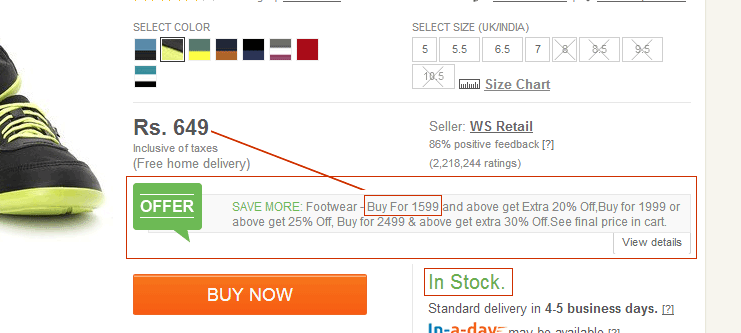
Product In Stock. Offer that is super-stretch for the user.
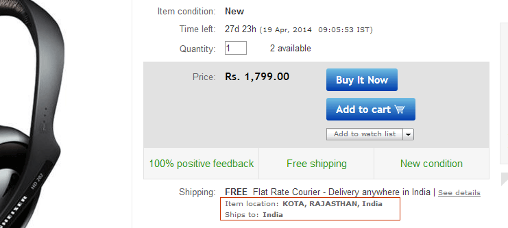
Ships From? Why a User needs to know as long as it reaches him on time.
Handling Exceptions are really important for every product that is being sold on a Ecommerce site. Simply because every product is different, so are its attributes and not all of them apply all the time.
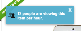
e. Staying away from Fancy Features
Get rid of fancy features on the product pages, some of them really make no sense.
Some of the top fancy features that are seen frequently on ecommerce websites are listed below. Though its debatable that few of them are required, the point to suggest here is not letting them interfere in the transaction process and keeping them passively available.
- Compare products on your site. There are different sites available for comparison and decision making.
- Ship to my pincode. While this feature has value, actively showing it to everyone does not. Good execution by Amazon India as a passive feature.
- Ask seller a question in Marketplaces. Is it scalable if the response is delayed by hours or days. Even users do not ask questions on top selling products.
- Login to Save in Wishlist. Almost everyone has feature – why. How many people come to wishlist on ecommerce sites again.
- Add to Favorites. This feature is great for social commerce or 100% design-only focus websites like Fab or Etsy, provided it adds value to user.
- SEO Fanciness – Many ecommerce services use without understanding how difficult it is for users to read.
- Vendor Information. Yes, we know you are marketplace, but there is a beautiful way to telling who the real seller is. (like Etsy).
- The filter for filters. Cool, but over period of time they all die and the data operations kill the user experience then.
- Comments on products. Again – engagement v/s commerce. Most services that have comments enabled, see user complaints and customer service related comments that further discourage buyers.
- Zillion Reviews that make no sense.
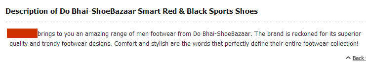
Fits SEO, but how helpful is this Product Descripion for user?
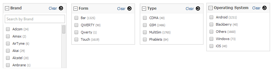
Fancy Filters – Helped me discover unknown Brands, Irrelevant Form ~ Touch is Qwerty or no. CDMA. Other OS > All known ones.
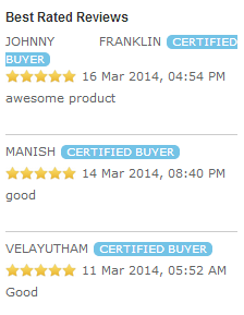
Reviews that make little sense
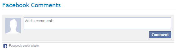
Facebook Comments – Why?
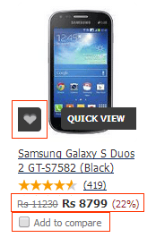
Favorite & Add to Compare
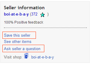
Definitely users don’t want to enter in a relationship with the seller.
How does this information matter?

Thanks for making this complicated. Users only care for price they will buy it for.
There is a huge buzz around content + commerce, I believe that both of them should not mix. Content products (like Twitter, Quora, or even Wishberg for example) should focus on engagement and time-sink for its users, while Commerce products (like Amazon, Flipkart and others) should focus on transactions that are completed as quickly as possible.
f. Photos: Picture Perfect Product Pages
How important are photos on your product pages. If the answer is yes very important, make it a standard practice for product photos to be over 500 x 350 pixels. Optional images are great, zoom-in to see larger photos absolutely great – but those are optional features, the main product image makes a lot of difference.
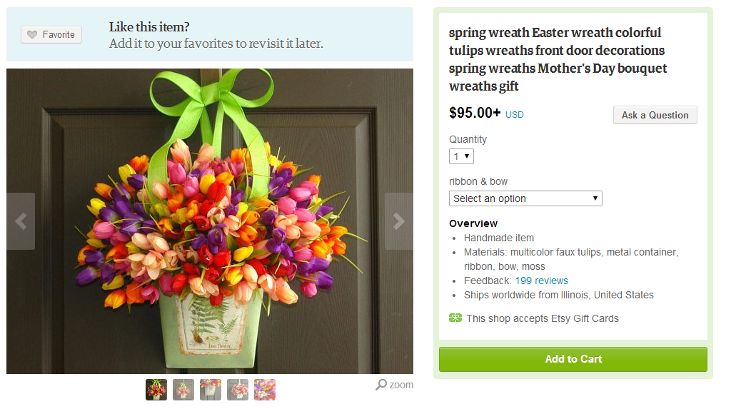
Large Product Photos on Etsy. Also look at NastyGal’s page shared above.
g. Recommendation that kill the Product Experience
Ecommerce sites should put a limit to the number of recommendations that are shown to the users. One of the best known Ecommerce site displays a stunning 9 set of recommendations on its product pages, that includes 35 products being recommended under pretext of ‘for you’.
Recommendations shown for a Mobile Phone
- More Mobile Phones from Samsung.
- Feature Phones from Samsung
- Recently Sold in Electronics & Gadgets
- Products Frequently purchased together
- More Android Mobile Phones
- People who viewed this item also viewed
- Top Selling Mobile Phones
- Products You Recently Viewed
- Recommendations based on your browsing history
Showing 35 recommendations does probably less for making up a buying decision and more for increasing dropouts or bounce rates of product pages. The ideal number of recommendations to be shown to user are 3-4 sets not more than that.
The ones that are most likely to help in conversion are:
- Products Frequently Brought Together (provided the combined price is not greater than 3X of product price). This recommendation can be also displayed at Cart Level.
- Customers who viewed this Product also Viewed. (Actual Recommendations)
- Recently Viewed Products
- Recommendations Based on Browsing History.
Flipkart & Amazon India does a great job with product recommendations.
—————————————————————————————————————–
Since I do not want this post to sound like a rant, I have attempted to re-create the first scroll product page (of the one mentioned in the first point here) by applying these best practices that I have mentioned here. This is how it looks. (Note: I am not a designer, this is recreated out of plain copy-paste tools.)
Product Page created by me based on the best practices mentioned here. Redesigned the first image.
Concluding Notes:
Indian Ecommerce is coming out of age now, its off to a great start. While challenges like operations, logistics and customer experience are being tackled with great enthusiasm to delight users, it is time to also look at getting product management principles right and ensure users have a right user-experience.
Something I missed completely is that not a single ecommerce site reminded me of their mobile apps, isn’t mobile supposed to be the next big thing? A simple feature like ‘Send this to Mobile’ will do wonders – there is a chance that I will further share the product on WhatsApp and ask friends & family.
Remember, users that come to ecommerce websites are not here to build relationship, they are merely here to transact. Some features like Add to Wishlist, Write a Review, Rate this Product, Comment on this Product, Showing Auto-Pop to ask Email (and later spamming with newsletter), etc are not the ones really care about when they are here to transact. They are passive features, completely optional. Don’t irritate your users!
“I’m not here to enter into a relationship. I just want to buy something.” from the famous post – The $300 Million Button by Usability Expert Jared Spoon.
Ending this post with one of my favorite quotes on this topic – “Every feature has some maintenance cost, and having fewer features lets us focus on the ones we care about and make sure they work very well.” – David Karp, Tumblr.
—–
The next post in this series will be Best Practices for Shopping Cart & Checkout Process.